
Study: leading cause of death among communists is communism
Experts: The revolution will be monetized
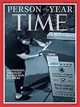
Media shocked to learn 'global intifada' means killing people around the globe
Harvard upgrades antisemitism from 'unfounded concern' to 'complex context'
University officials condemn violence, urge students to avoid 'harmful specificity,' 'jumping to adjectives,' 'noticing patterns,' or 'assigning motives' to motives
NPR rebrands antisemitism as 'community tensions,' adds somber piano music
Anchor: hate is wrong, but also 'understandable' under certain editorial guidelines
Panel concludes “from the river to the sea” refers to nature hikes and inclusive trail access
Experts: free speech safest when pre-approved
Manhattan renamed 'They-hattan'; Madison Avenue apologizes for misgendering itself
As media accuse ICE of cruelty, Ukraine wonders if returning Russians to Russia is culturally insensitive
Epstein files don mustache and sombrero combo; Democrats praise 'cultural enrichment'
NPR unveils new game show: 'Wait-wait… don’t deport me!'
Progressive experts alarmed: troops may now be ordered to engage the enemy, not identify as it
 New American Pope to host first-ever Vatican tailgate
American Pope’s first tweet: “Just got off the phone with Jesus. Huge stuff coming.”
This day in alternative history: Federal district court judge blocks President Lincoln's Emancipation Proclamation Executive Order
The mains in Spain fail mainly under strain
Kamala Harris to lead task force on understanding what she just said
Cool Trends: The trans child has replaced the Louis Vuitton handbag as suburban status symbol
Teachers’ Union Manual redefines the three Rs as Racism, Reparations, and Rioting
Once the Trans-Visibility Easter Sunday is over, Biden to declare the rest of 2024 National Forgiveness of Bribery and Influence Peddling Year
The Pope concedes Lucifer's win, hoists a white flag over the Vatican
TPC Study: If all cultures are equal, no one needs asylum
 Due to EV cold-weather issues, EPA orders winter migration south for all northern state residents
WH economists forecast 2024 will feel like a recession but assure it's not
And just like that, COEXIST bumper stickers disappear, replaced with GENOCIDE bumper stickers.

Negotiations fail to pause hostilities between the Biden administration and America
Joe Biden’s talks with China lead to new national program, ‘The Great Leap Backwards’
Dear Democrats: 1930s Germany called; they want their antisemitism back
Community organizers: We are all in this together until you are of no further use.
TIME magazine names Hamas World's Most Sexy Murderers, Rapists, Sadistic Torturers
Mideast crisis: Gaza hospitals running out of rocket launchers and human shields
Climate activists: you are the carbon we want to reduce
Democrats to cancel Chicago Convention; replace it with all mail-in ballots
Hamas request permanent cease-fire in Oakland, CA
Bad weather causes President Biden to proclaim National Political Emergency
School cancels course on Critical Critical Studies that used Critical Studies methodology to examine Critical Studies
News you can use: CBSABCNBCCNNMSNBC+ is trans-truth and demands the right to be truth

Breaking: Thousands of new Chinese spy balloons fly over U.S., painted with Biden 2024 campaign posters
New rule: calling Chinese spy balloons “Chinese” is deemed racist
Breaking: Biden promises to shoot down Chinese spy balloon as soon as it gets as high as Hunter
 Hurricane Update: Fears arise that Gov. Ron DeSantis may reroute Hurricane Ian from Florida coast to Martha's Vineyard
Study: People who define themselves by what they stand against, are usually afraid to tell people what they stand for
Liz Cheney: Voters need to ask themselves, why they are so out of touch with their politicians
White House: IRS toy guns for children are now politically correct, mandatory
BREAKING: Biden's economic sanctions on the U.S. to be partially lifted prior to November election
 GOP's new slogan for midterms: Make Dissent Patriotic Again
PSA: Due to high gas prices police departments will now be responding and making arrests via Zoom.
NYT: Roe vs Wade to be renamed the "Don't Say Fetus" law
Democrats insist on carrying unwanted presidency to term
Elon Musk went to bed thinking he owns Twitter. Then the mail-in ballots arrived at 2am...
 Obama: "If you like your information you can keep your information"
Fact checkers reveal Biden handler not a real Easter bunny
Biden 2021: you'll save $0.16 on 4th of July BBQ!
Biden 2022: you'll save a ton of $$ if you don't eat this 4th of July!
Disney to buy Epstein Island for new theme park
The Biology Underground is like the Weather Underground, except they are real biologists and they've had to go underground
"Psssst. Hey you, kid. Ya wanna watch a Disney movie with me?"
"I am not suicidal," says COVID-19 after being contracted by Hillary Clinton
Trans-swimmer Lia Thomas's trophy is smaller than for male swimmers, and only 73% gold
Sources: U.S. now considers majority of U.S. citizens a threat to U.S.
BREAKING: Russian General claims he was beaten up outside Ukrainian bio lab by two Nazis who poured vodka and caviar over him and yelled "This is NATO Country!"
Global warming news: 100,000 Russian migrants fleeing climate change about to march into Ukraine
Future headline: Donald Trump to buy CNN for one dollar
Georgia Governor Stacy Abrams feels honored to be the new Supreme Court justice
President Biden: 'Vote for me or I'll shoot this foot'
Fact checkers give Pinocchio's speech four Bidens
Fauci: The only thing we have to fear, is a lack of fear itself!
Study: Most people have had sex more violent than January 6th
 Facebook permanently bans Facebook from Facebook for violating Facebook community standards
New remake of the 1950's horror movie Them to be titled Them/They
Teachers Union: Idea that CRT is being taught in K-12 just a conspiracy theory by white supremacists trying to maintain their systemically racist police state


Xze/She/He who controls the past controls the future; Xze/She/He who controls the present controls the past
S ocialists vow to fight against Critical Socialism Theory
A more perfect Soviet Union: the Party pretends it unites us, and we pretend we are united
Biden solves border crisis with free direct flights from Central America to major metropolitan areas
 Critical race theory: destroy the world of systemic racism, build a world of systemic race-baiting
In the future everyone will get canceled for fifteen minutes
Biden proposes bill to spend two trillion dollars on more money printing factories
Social unity: They pretend to hold elections and we pretend we voted
 Immigrants to Texas and Florida from New York and California break down and cry when they realize all their sacrifices for a better tomorrow were based on lies
China anal swabs detect new 'silent but deadly' transmission of covid-19 variant
Social science breakthrough: 'White' is the new way of saying 'Bourgeois'
Biden administration swat teams make sweeping arrests of underground female-only track meets
'Green energy' to be renamed 'blackout energy' for easier comprehension of climate complexities
New children's game: Rock, Paper, Scissors, Science
Texas: Biden administration sends emergency wind turbines to help fight the blackouts
BREAKING: Biden signs executive order canceling the number 45
ATTENTION: It is your duty to report anyone who says this is no longer a free country. Fact-checking commissars are monitoring all state-approved social media platforms for your convenience
OUT: If you don't vote, you can't complain!
IN: If you didn't vote Democrat, you can't complain!
Social media justice: followers removed from pro-Trump accounts will be added to Biden's Twitter account
Fact check: a democratic election is the one in which votes are counted until Democrats win
JUST IN: China bans Twitter for being too totalitarian
Pelosi introduces new House rule to replace 'gender' terms like mother, daughter, father, son with the word 'comrade'; the only acceptable pronoun will also be 'comrade'

Sources: Biden transition team demands access to White House basement to begin renovations
BREAKING: President Trump pardons America for its past
Prime Minister Modi: to avoid accusations of racism India will change its name to Cleveland
Biden creates Antifascist Librarian Justice Committee; the first book scheduled for burning is Fahrenheit 451
 Media study: 148% of Americans believe voter fraud doesn't exist
2020 Election forecast: if Joe Biden emerges from the basement on Election Day and sees his shadow, expect four more years of Trump
BREAKING: President Trump pardons Corn Pop
Toobin, though on administrative leave, is still pulling for Biden
 Chinese whistleblower: Biden-20 was genetically engineered in a Wuhan lab
Nancy Pelosi sponsors a bill to create the office of removal of the President
New college humanities major: Critical Trump Studies
Opinion: Joe Biden is just an idea
CNN: Biden took a solid second place in the debate, while Trump only came next to last
Having ordered that all Californians switch to electric cars by 2035, Gov. Gavin Newsom follows up by mandating them to have electricity by 2035
Election 2020: Joe Biden pledges to a peaceful post-election transfer of power to George Soros
Out: Flatten the curve. In: Flatten the country.
Breaking: the Democrat Party has finished transitioning from being the party of JFK to being the party of Lee Harvey Oswald
Paradigm shift in Chromatics: Study shows Indigo (#3F00FF) mixed with Jamaic (#C0FF01) yields Black (#000000)
 Study: the trouble with wokeism is eventually you run out of victims
Stacey Abrams refuses to concede to Harris; declares herself Biden's VP
Election 2020: Spunky former presidential candidate wins VP slot by a head
Churches in many states to hold services in opened up pubs and bars
Election 2020: Xi Jinping still undecided on vice president for Joe Biden
 Reports: Republicans pounce on 'Republicans pounce' reports
Minneapolis launches online looting app to combat Covid-19
DNC study finds lockdowns no longer necessary as the economy is now being destroyed more effectively by looters and rioters
With America in lockdown, China offers to host Democrat primary
Bernie Sanders tests negative for President
In related news, Joe Biden follows other candidates in withdrawing from race and endorsing Joe Biden
New York Governor Cuomo shuts down all 'non-essential' business, surprised to find himself out of a job
 Biden commits to picking a woman as running mate as long as she passes his sniff test
Joe Biden's coronavirus prevention tips: always rub hand sanitizer on young girls before sniffing and fondling them
Russian lawmakers warned that the American Democrats are meddling to re-elect Putin
Joe Biden promises lucrative board member jobs as door prizes to get people to his rallies
 Democrats now worried they might even lose the illegal alien vote
Soleimani's remains FedExed back to Iran and now no one knows what happened to the box
BREAKING: massive search underway in Iran after Soleimani's boxed FedEx'd remains stolen off front porch
Liz Warren harshly critical of Biden's suggestion to coal miners that they should learn to code, offers to have them trained as romance novelists instead
 Pelosi: "First we have to impeach Donald Trump before we can find out why we impeached him."
Schiff calls his Amazon Alexa to testify: 'She knows absolutely everything'
Iran answers to new Reagan statue in Berlin by erecting Obama statue at Tehran airport where he delivered pallets of cash
California accepts award for most progressive environmental policies; further progressive developments to be announced as blackouts permit
BREAKING: Romney DNA test reveals he is 1/1024th Republican
 California Governor Gavin Newsom blames electricity blackouts on Ukrainian kulaks, vows revenge
Rat falling from White House ceiling fears for his life, begs reporters for protection, offers a tell-all memoir
Latest UN climate report shows this month so far has seen the scariest climate pronouncements on record
Climate science: there's no need for climate protests in China because China is already communist
 Islamic clerics split on whether Reps. Ilhan Omar and Rashida Tlaib should be traveling around the world without an accompanying male relative
Dem candidates call for the Beatles' song 'Get Back' and the 'White Album' to be banned; surviving two white guys of the group must pay reparations
Bond's number is up: next 007 will be a black woman, played by Barack Obama
NYT: moon landing was one small step for Man, one giant leap for White Male Supremacy
HURRICANE WATCH: Tropical storm Barry has records sealed, once offshore expected to change name to Barack
Trump politicizes the 4th of July, declares it henceforth to be called the 45th of July, or July the Trumpth
Barack Obama critical of Trump for failing to insert 'I, me, my' into his 4th of July speech: "very unpresidential!"
Congressional Democrats: John Dean's testimony proves Trump is Nixon in disguise and must be impeached
Bernie Sanders admits to being a millionaire, promises to eat himself if nominated
 International Women's Day observed, women only paid 73% of attention afforded to men
Democrats: anti-Semitism means never having to say you're sorry
AOC: aborting babies helps preserve the planet for the next generation
Bernie Sanders launches presidential campaign, promises to "build a great big beautiful Iron Curtain" around America if elected
 West Virginia renames itself Eastern Kentucky to avoid further embarrassment from Virginia
BREAKING: Justice Ginsburg released from hospital after breaking 3 ribs at late night bar brawl in Adams Morgan
DNA news: Senator Warren tanking in latest totem polls
Orwell studies: 84% of academics believe problems raised in 1984 can be fixed with solutions from Animal Farm
 Progress in gender justice: online dating industry issues recommendations for men to wear body cameras, bring attorneys as chaperones
Study: the only people who don't know what socialism is are the socialists
Poll: 1 in 3 #FightFor15 activists believe movement is related to lowering the age of consent across America
CNN expert: Kavanaugh confirmation will increase global warming by 3 degrees
Harry Reid comes forth to say Judge Kavanaugh didn't pay any taxes in high school
Hollywood to America: If you've got a flag on the Moon, you didn't plant that; some other country made that happen
Protest march in straight jackets against Trump ends in chaos as participants try but fail to free themselves
HEADLINES YOU WILL NEVER SEE: California Gov. Jerry Brown single-handedly stops wildfires in his state by issuing an immediate statewide ban on wildfires
San Francisco closes all Planned Parenthood clinics after sting operation catches employees using plastic straws
Vegan mother undergoes experimental surgery to force her breasts to produce almond milk
With none of his emails answered, frustrated Nigerian man commits suicide and leaves $100bn fortune to charity
California gives new meaning to strawman argument as caped Strawman battles supervillains in restaurants, bars, and fast food joints
Violence increases in Mexico as cartels switch from smuggling drugs to plastic straws to San Francisco
Obama proposes a Paris Economic Change agreement among nations to address how world will cope with future runaway economic warming
Stormy Daniels plans border visit to give migrant children freebies
San Francisco: man dumping off 20 lbs of human waste in plastic bag on street corner cited for using non-biodegradable plastic bag
BREAKING: ICE renamed Planned Citizenship, immediately absolving it of all criticism
Senate Democrats demand Supreme Court nominee not be unduly influenced by U.S. Constitution
BREAKING: In 2018, Obama and Biden can finally celebrate Recovery Summer
 IG Report: the FBI broke the law, but since there was no criminal intent, no reasonable prosecutor would bring such a case
Pelosi on Trump's MS-13 "animals" comments: "Four legs good, two legs bad"
Iran nuclear talks set to resume between the United States and John Kerry
Report: The Mueller investigation has finally determined that the lyrics to Louie Louie are not about Trump and Russian collusion
 MARKETS: Demand for carbon credits spikes as Hamas seeks to undo damage to Earth's atmosphere caused by burning 10,000 tires on Gaza border
BREAKING: After state reassignment surgery Pennsylvania will henceforth be known as Transylvania
 Experts: If we don't act now, unicorns will be extinct in just ten years. Children will ask, "Mommy, what's a unicorn?" Women and minorities will be forced to seek alternative hallucinations
Korean war must continue: Hawaiian federal judge declares Trump's peace effort unconstitutional
New York: feminists march on Broadway, demand the street be given new, non-misogynistic name
 Experts: California's planned transition of all state jobs from citizens to illegal aliens by 2020 will help to avoid bankruptcy and save money for social programs for illegal aliens
Putin: If I didn't want Hillary to be president she would be dead
Doritos maker PepsiCo to introduce snack line for women; new Doritas™ chips will be 77% as big as Doritos and won't make any scary 'crunchy noises'
TMZ: Tooth Fairy accused of sexually assaulting millions of children, outs self as Transgendered Tooth Recovery Specialist
RUSSIA COLLUSION: Trump offers Putin to trade Rep. Maxine Waters for two unnamed members of the State Duma
Ikea founder dead at 91; his coffin arrived in a box with confusing instructions and took 3 hours to assemble
This Thanksgiving ex-president Obama continues with his tradition of apologizing to turkeys everywhere for the injustice they suffered since America's founding
 Oslo, Norway: 2017 Nobel Peace Prize goes to advocacy group about which you'll forget immediately after reading this headline
Cambridge, MA, library to replace racist 'Cat in the Hat' with inclusive 'Che in a Beret'
Millions of men worldwide eagerly await broadcast of Hugh Hefner's funeral, solely for the articles
Bill Gates offers to pay for Trump's wall on condition he gets to install Windows
 Bernie Sanders introduces single-payer public transportation bill to end America's unequal, unfair, and expensive private transportation system
DNC embroiled in controversy after official Twitter account accidentally 'likes' pictures of US Constitution and Bill of Rights
Hurricane Irma hits Cuba, causes millions of dollars worth of improvements to property and infrastructure
Climate study: extreme weather may be caused by unlicensed witches casting wrong spells in well-meaning effort to destroy Trump
Ex-president Obama declares Irma "Hurricane of Peace," urges not to jump to conclusions and succumb to stormophobia
CNN: Trump reverses Obama's executive order banning hurricanes
ISIS claims responsibility for a total solar eclipse over the lands of American crusaders and nonbelievers
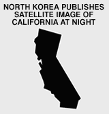
When asked if they could point to North Korea on a map many college students didn't know what a map was
CNN: We must bring America into the 21st century by replacing the 18th century Constitution with 19th century poetry
Pelosi: 'We have to impeach the president in order to find out what we impeached him for'
BREAKING: As of Saturday July 8, 2017, all of Earth's ecosystems have shut down as per Prince Charles's super scientific pronouncement made 96 months ago. Everything is dead. All is lost. Life on Earth is no more.
DNC to pick new election slogan out of four finalists: 'Give us more government or everyone dies,' 'Vote for Democrats or everyone dies,' 'Impeach Trump or everyone dies,' 'Stop the fearmongering or everyone dies'
 Al Gore's "An Inconvenient Sequel: Truth to Power" is humanity's last chance to save the Earth before it ends five years ago
Experts: The more we embrace diversity the more everything is the same
BOMBSHELL: TMZ offers Kathy Griffin $5 mil to keep any future sex tape private
DEVELOPING: CNN, WaPo, NYT anonymous sources say Vladimir Putin may have ties to Russia
BREAKING: Manning and Snowden have come out with strong condemnation of Donald Trump leaking classified information to Russia
Gun store goes into lockdown over report an "active university professor" roving the grounds
Dozens injured at Ralph Lauren & Louis Vuitton headquarters after Ivanka calls in missile strikes on rival fashion houses
BOMBSHELL: Evidence proves Donald Trump conspired with his campaign to defeat Hillary Clinton
University ranked "very intolerant of free speech" fights the accusation by banning the study and all involved
Concerned that Russians don't consume enough alcohol in the month of March, Russia's Orthodox Church makes St. Patrick's Day official holiday
Grassroots group calls for "The Million Regulators March" on Washington, supported by all who fear the loss of their betters telling them what to do
Experts: Starbucks CEO Schultz's hiring of 10,000 Muslim refugees likely to blow up in his face
 Will the groundprog be frightened by its own shadow and hide - or will there be another season of insane protests?
Trump signs executive order making California and New York national monuments; residents have two days to vacate
 Women's March against fascism completed with 400,000 fewer deaths than anticipated
Feminist historians uncover ghastly concentration camps where so-called "housewives" were forced to live inauthentic lives slaving away in kitchens
Dictionary of the future: Global Warming was a popular computer simulation game, where the only way to win was not to play
"Anti-fascist" groups violently protest misspelling of their original name, "aren't-we-fascists"
 Post-inauguration blues: millions of democrats distraught as the reality of having to find real jobs sets in
"Journalism is the continuation of war by other means" is exposed as a fake quote by mainstream media journalists

Congressional Democrats: "We cannot just simply replace Obamacare with freedom because then millions of Americans will suddenly become free"
Schoolchildren jailed for building only white snowmen
Obama's reckless attacks on Russia serve as recruitment tool to create more Russian hackers
Hillary: "I lost, so I'm going to follow our democratic traditions, poison the wells, and scorch the earth"
Children in Venezuela cook and eat their Christmas toys
Hillary: "I can hack Russia from my bathroom"
Hillary suggests to counter "fake news" with government newspaper called "Truth" ("Pravda" for Russian speakers)
 BREAKING: Millions of uncounted votes found on Hillary's private voting machine in her Chappaqua bathroom
New York Times: Fidel Castro world's sexiest corpse
After years of trial and error, CIA finally succeeds with the "waiting it out" technique on Fidel Castro
 Post-election shopping tip: look for the PoliticsFree label at your local grocer to make sure you don't buy from companies that don't want your business anymore
In Hillary's America, email server scrubs you
Obama transfers his Nobel Peace Prize to anti-Trump rioters
Democrats blame Hillary's criminal e-mail server for her loss, demand it face prison
 Afraid of "dangerous" Trump presidency, protesters pre-emptively burn America down to the ground
Clinton Foundation in foreclosure as foreign donors demand refunds
Hillary Clinton blames YouTube video for unexpected and spontaneous voter uprising that prevented her inevitable move into the White House
Sudden rise in sea levels explained by disproportionately large tears shed by climate scientists in the aftermath of Trump's electoral victory
FBI director Comey delighted after receiving Nobel Prize for Speed Reading (650,000 emails in one week)
U.N. deploys troops to American college campuses in order to combat staggeringly low rape rates
Responding to Trump's surging poll numbers, Obama preemptively pardons himself for treason
Following hurricane Matthew's failure to devastate Florida, activists flock to the Sunshine State and destroy Trump signs manually
Tim Kaine takes credit for interrupting hurricane Matthew while debating weather in Florida
Study: Many non-voters still undecided on how they're not going to vote
The Evolution of Dissent: on November 8th the nation is to decide whether dissent will stop being racist and become sexist - or it will once again be patriotic as it was for 8 years under George W. Bush
Venezuela solves starvation problem by making it mandatory to buy food
Breaking: the Clinton Foundation set to investigate the FBI
Obama captures rare Pokémon while visiting Hiroshima
 Movie news: 'The Big Friendly Giant Government' flops at box office; audiences say "It's creepy"
Barack Obama: "If I had a son, he'd look like Micah Johnson"
White House edits Orlando 911 transcript to say shooter pledged allegiance to NRA and Republican Party
President George Washington: 'Redcoats do not represent British Empire; King George promotes a distorted version of British colonialism'
Following Obama's 'Okie-Doke' speech, stock of Okie-Doke soars; NASDAQ: 'Obama best Okie-Doke salesman'
Weaponized baby formula threatens Planned Parenthood office; ACLU demands federal investigation of Gerber
Experts: melting Antarctic glacier could cause sale levels to rise up to 80% off select items by this weekend
Travel advisory: airlines now offering flights to front of TSA line
As Obama instructs his administration to get ready for presidential transition, Trump preemptively purchases 'T' keys for White House keyboards
John Kasich self-identifies as GOP primary winner, demands access to White House bathroom
Upcoming Trump/Kelly interview on FoxNews sponsored by 'Let's Make a Deal' and 'The Price is Right'
News from 2017: once the evacuation of Lena Dunham and 90% of other Hollywood celebrities to Canada is confirmed, Trump resigns from presidency: "My work here is done"
Non-presidential candidate Paul Ryan pledges not to run for president in new non-presidential non-ad campaign
Trump suggests creating 'Muslim database'; Obama symbolically protests by shredding White House guest logs beginning 2009
National Enquirer: John Kasich's real dad was the milkman, not mailman
National Enquirer: Bound delegates from Colorado, Wyoming found in Ted Cruz’s basement
Iran breaks its pinky-swear promise not to support terrorism; US State Department vows rock-paper-scissors strategic response
Women across the country cheer as racist Democrat president on $20 bill is replaced by black pro-gun Republican
Federal Reserve solves budget crisis by writing itself a 20-trillion-dollar check
Widows, orphans claim responsibility for Brussels airport bombing
 Che Guevara's son hopes Cuba's communism will rub off on US, proposes a long list of people the government should execute first
Susan Sarandon: "I don't vote with my vagina." Voters in line behind her still suspicious, use hand sanitizer
Campaign memo typo causes Hillary to court 'New Black Panties' vote
New Hampshire votes for socialist Sanders, changes state motto to "Live FOR Free or Die"
Martin O'Malley drops out of race after Iowa Caucus; nation shocked with revelation he has been running for president
 Statisticians: one out of three Bernie Sanders supporters is just as dumb as the other two
Hillary campaign denies accusations of smoking-gun evidence in her emails, claims they contain only smoking-circumstantial-gun evidence
 Obama stops short of firing US Congress upon realizing the difficulty of assembling another group of such tractable yes-men
In effort to contol wild passions for violent jihad, White House urges gun owners to keep their firearms covered in gun burkas
TV horror live: A Charlie Brown Christmas gets shot up on air by Mohammed cartoons
 Democrats vow to burn the country down over Ted Cruz statement, 'The overwhelming majority of violent criminals are Democrats'
Russia's trend to sign bombs dropped on ISIS with "This is for Paris" found response in Obama administration's trend to sign American bombs with "Return to sender"
 University researchers of cultural appropriation quit upon discovery that their research is appropriation from a culture that created universities
Archeologists discover remains of what Barack Obama has described as unprecedented, un-American, and not-who-we-are immigration screening process in Ellis Island
 Mizzou protests lead to declaring entire state a "safe space," changing Missouri motto to "The don't show me state"
Green energy fact: if we put all green energy subsidies together in one-dollar bills and burn them, we could generate more electricity than has been produced by subsidized green energy
State officials improve chances of healthcare payouts by replacing ObamaCare with state lottery
NASA's new mission to search for racism, sexism, and economic inequality in deep space suffers from race, gender, and class power struggles over multibillion-dollar budget
 College progress enforcement squads issue schematic humor charts so students know if a joke may be spontaneously laughed at or if regulations require other action
ISIS opens suicide hotline for US teens depressed by climate change and other progressive doomsday scenarios
 Virginia county to close schools after teacher asks students to write 'death to America' in Arabic
'Wear hijab to school day' ends with spontaneous female circumcision and stoning of a classmate during lunch break
ISIS releases new, even more barbaric video in an effort to regain mantle from Planned Parenthood
 Impressed by Fox News stellar rating during GOP debates, CNN to use same formula on Democrat candidates asking tough, pointed questions about Republicans
Shocking new book explores pros and cons of socialism, discovers they are same people
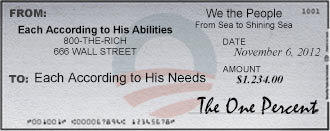
 Pope outraged by Planned Parenthood's "unfettered capitalism," demands equal redistribution of baby parts to each according to his need
John Kerry accepts Iran's "Golden Taquiyya" award, requests jalapenos on the side
Citizens of Pluto protest US government's surveillance of their planetoid and its moons with New Horizons space drone
 John Kerry proposes 3-day waiting period for all terrorist nations trying to acquire nuclear weapons
Chicago Police trying to identify flag that caused nine murders and 53 injuries in the city this past weekend
Cuba opens to affordable medical tourism for Americans who can't afford Obamacare deductibles
 State-funded research proves existence of Quantum Aggression Particles (Heterons) in Large Hadron Collider
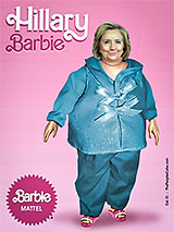
Student job opportunities: make big bucks this summer as Hillary’s Ordinary-American; all expenses paid, travel, free acting lessons
 Experts debate whether Iranian negotiators broke John Kerry's leg or he did it himself to get out of negotiations
Junior Varsity takes Ramadi, advances to quarterfinals
US media to GOP pool of candidates: 'Knowing what we know now, would you have had anything to do with the founding of the United States?'
 NY Mayor to hold peace talks with rats, apologize for previous Mayor's cowboy diplomacy
China launches cube-shaped space object with a message to aliens: "The inhabitants of Earth will steal your intellectual property, copy it, manufacture it in sweatshops with slave labor, and sell it back to you at ridiculously low prices"
 Progressive scientists: Truth is a variable deduced by subtracting 'what is' from 'what ought to be'
Experts agree: Hillary Clinton best candidate to lessen percentage of Americans in top 1%
America's attempts at peace talks with the White House continue to be met with lies, stalling tactics, and bad faith
Starbucks new policy to talk race with customers prompts new hashtag #DontHoldUpTheLine
 Hillary: DELETE is the new RESET
Charlie Hebdo receives Islamophobe 2015 award; the cartoonists could not be reached for comment due to their inexplicable, illogical deaths
 Russia sends 'reset' button back to Hillary: 'You need it now more than we do'
Barack Obama finds out from CNN that Hillary Clinton spent four years being his Secretary of State
President Obama honors Leonard Nimoy by taking selfie in front of Starship Enterprise
Police: If Obama had a convenience store, it would look like Obama Express Food Market
 Study finds stunning lack of racial, gender, and economic diversity among middle-class white males
NASA: We're 80% sure about being 20% sure about being 17% sure about being 38% sure about 2014 being the hottest year on record
 People holding '$15 an Hour Now' posters sue Democratic party demanding raise to $15 an hour for rendered professional protesting services
Cuba-US normalization: US tourists flock to see Cuba before it looks like the US and Cubans flock to see the US before it looks like Cuba
White House describes attacks on Sony Pictures as 'spontaneous hacking in response to offensive video mocking Juche and its prophet'
CIA responds to Democrat calls for transparency by releasing the director's cut of The Making Of Obama's Birth Certificate
Obama: 'If I had a city, it would look like Ferguson'
 Biden: 'If I had a Ferguson (hic), it would look like a city'
Obama signs executive order renaming 'looters' to 'undocumented shoppers'
Ethicists agree: two wrongs do make a right so long as Bush did it first
 The aftermath of the 'War on Women 2014' finds a new 'Lost Generation' of disillusioned Democrat politicians, unable to cope with life out of office
White House: Republican takeover of the Senate is a clear mandate from the American people for President Obama to rule by executive orders
Nurse Kaci Hickox angrily tells reporters that she won't change her clocks for daylight savings time
Democratic Party leaders in panic after recent poll shows most Democratic voters think 'midterm' is when to end pregnancy
 Desperate Democratic candidates plead with Obama to stop backing them and instead support their GOP opponents
Ebola Czar issues five-year plan with mandatory quotas of Ebola infections per each state based on voting preferences
 Study: crony capitalism is to the free market what the Westboro Baptist Church is to Christianity
Fun facts about world languages: the Left has more words for statism than the Eskimos have for snow
 African countries to ban all flights from the United States because "Obama is incompetent, it scares us"
Nobel Peace Prize controversy: Hillary not nominated despite having done even less than Obama to deserve it
Obama: 'Ebola is the JV of viruses'
BREAKING: Secret Service foils Secret Service plot to protect Obama
 Revised 1st Amendment: buy one speech, get the second free
Sharpton calls on white NFL players to beat their women in the interests of racial fairness
President Obama appoints his weekly approval poll as new national security adviser
Obama wags pen and phone at Putin; Europe offers support with powerful pens and phones from NATO members
 White House pledges to embarrass ISIS back to the Stone Age with a barrage of fearsome Twitter messages and fatally ironic Instagram photos
Obama to fight ISIS with new federal Terrorist Regulatory Agency
 Obama vows ISIS will never raise their flag over the eighteenth hole
Harry Reid: "Sometimes I say the wong thing"
Elian Gonzalez wishes he had come to the U.S. on a bus from Central America like all the other kids
Obama visits US-Mexican border, calls for a two-state solution
 Obama draws "blue line" in Iraq after Putin took away his red crayon
"Hard Choices," a porno flick loosely based on Hillary Clinton's memoir and starring Hillary Hellfire as a drinking, whoring Secretary of State, wildly outsells the flabby, sagging original
Accusations of siding with the enemy leave Sgt. Bergdahl with only two options: pursue a doctorate at Berkley or become a Senator from Massachusetts

Jay Carney stuck in line behind Eric Shinseki to leave the White House; estimated wait time from 15 min to 6 weeks
100% of scientists agree that if man-made global warming were real, "the last people we'd want to help us is the Obama administration"
Jay Carney says he found out that Obama found out that he found out that Obama found out that he found out about the latest Obama administration scandal on the news
"Anarchy Now!" meeting turns into riot over points of order, bylaws, and whether or not 'kicking the #^@&*! ass' of the person trying to speak is or is not violence
Obama retaliates against Putin by prohibiting unionized federal employees from dating hot Russian girls online during work hours

Russian separatists in Ukraine riot over an offensive YouTube video showing the toppling of Lenin statues
 "Free Speech Zones" confuse Obamaphone owners who roam streets in search of additional air minutes
Obamacare bolsters employment for professionals with skills to convert meth back into sudafed
 Gloves finally off: Obama uses pen and phone to cancel Putin's Netflix account
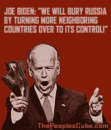
Joe Biden to Russia: "We will bury you by turning more of Eastern Europe over to your control!"
In last-ditch effort to help Ukraine, Obama deploys Rev. Sharpton and Rev. Jackson's Rainbow Coalition to Crimea
Al Sharpton: "Not even Putin can withstand our signature chanting, 'racist, sexist, anti-gay, Russian army go away'!"
 Mardi Gras in North Korea: "Throw me some food!"
Obama's foreign policy works: "War, invasion, and conquest are signs of weakness; we've got Putin right where we want him"
US offers military solution to Ukraine crisis: "We will only fight countries that have LGBT military"
Putin annexes Brighton Beach to protect ethnic Russians in Brooklyn, Obama appeals to UN and EU for help
 The 1980s: "Mr. Obama, we're just calling to ask if you want our foreign policy back. The 1970s are right here with us, and they're wondering, too."
In a stunning act of defiance, Obama courageously unfriends Putin on Facebook
MSNBC: Obama secures alliance with Austro-Hungarian Empire against Russia’s aggression in Ukraine
 Study: springbreak is to STDs what April 15th is to accountants
Efforts to achieve moisture justice for California thwarted by unfair redistribution of snow in America
North Korean voters unanimous: "We are the 100%"
Leader of authoritarian gulag-site, The People's Cube, unanimously 're-elected' with 100% voter turnout
Super Bowl: Obama blames Fox News for Broncos' loss
 Feminist author slams gay marriage: "a man needs a man like a fish needs a bicycle"
Beverly Hills campaign heats up between Henry Waxman and Marianne Williamson over the widening income gap between millionaires and billionaires in their district
Biden to lower $10,000-a-plate Dinner For The Homeless to $5,000 so more homeless can attend
Kim becomes world leader, feeds uncle to dogs; Obama eats dogs, becomes world leader, America cries uncle
 North Korean leader executes own uncle for talking about Obamacare at family Christmas party
White House hires part-time schizophrenic Mandela sign interpreter to help sell Obamacare
Kim Jong Un executes own "crazy uncle" to keep him from ruining another family Christmas

OFA admits its advice for area activists to give Obamacare Talk at shooting ranges was a bad idea
President resolves Obamacare debacle with executive order declaring all Americans equally healthy
Obama to Iran: "If you like your nuclear program, you can keep your nuclear program"
 Bovine community outraged by flatulence coming from Washington DC
Obama: "I'm not particularly ideological; I believe in a good pragmatic five-year plan"
Shocker: Obama had no knowledge he'd been reelected until he read about it in the local newspaper last week
 Server problems at HealthCare.gov so bad, it now flashes 'Error 808' message
NSA marks National Best Friend Day with official announcement: "Government is your best friend; we know you like no one else, we're always there, we're always willing to listen"
Al Qaeda cancels attack on USA citing launch of Obamacare as devastating enough

The President's latest talking point on Obamacare: "I didn't build that"
 Dizzy with success, Obama renames his wildly popular healthcare mandate to HillaryCare
Carney: huge ObamaCare deductibles won't look as bad come hyperinflation
Washington Redskins drop 'Washington' from their name as offensive to most Americans
Poll: 83% of Americans favor cowboy diplomacy over rodeo clown diplomacy
 GOVERNMENT WARNING: If you were able to complete ObamaCare form online, it wasn't a legitimate gov't website; you should report online fraud and change all your passwords
Obama administration gets serious, threatens Syria with ObamaCare
Obama authorizes the use of Vice President Joe Biden's double-barrel shotgun to fire a couple of blasts at Syria
Sharpton: "British royals should have named baby 'Trayvon.' By choosing 'George' they sided with white Hispanic racist Zimmerman"
 DNC launches 'Carlos Danger' action figure; proceeds to fund a charity helping survivors of the Republican War on Women
Nancy Pelosi extends abortion rights to the birds and the bees
Hubble discovers planetary drift to the left
Obama: 'If I had a daughter-in-law, she would look like Rachael Jeantel'
 FISA court rubberstamps statement denying its portrayal as government's rubber stamp
Every time ObamaCare gets delayed, a Julia somewhere dies
GOP to Schumer: 'Force full implementation of ObamaCare before 2014 or Dems will never win another election'
 Obama: 'If I had a son... no, wait, my daughter can now marry a woman!'
Janet Napolitano: TSA findings reveal that since none of the hijackers were babies, elderly, or Tea Partiers, 9/11 was not an act of terrorism
News Flash: Sen. Mary Landrieu (D-LA) can see Canada from South Dakota
 Susan Rice: IRS actions against tea parties caused by anti-tax YouTube video that was insulting to their faith
Drudge Report reduces font to fit all White House scandals onto one page
Obama: the IRS is a constitutional right, just like the Second Amendment
 White House: top Obama officials using secret email accounts a result of bad IT advice to avoid spam mail from Nigeria
Jay Carney to critics: 'Pinocchio never said anything inconsistent'
Obama: If I had a gay son, he'd look like Jason Collins
 Gosnell's office in Benghazi raided by the IRS: mainstream media's worst cover-up challenge to date
IRS targeting pro-gay-marriage LGBT groups leads to gayest tax revolt in U.S. history
 After Arlington Cemetery rejects offer to bury Boston bomber, Westboro Babtist Church steps up with premium front lawn plot
Boston: Obama Administration to reclassify marathon bombing as 'sportsplace violence'
Study: Success has many fathers but failure becomes a government program
 US Media: Can Pope Francis possibly clear up Vatican bureaucracy and banking without blaming the previous administration?
Michelle Obama praises weekend rampage by Chicago teens as good way to burn calories and stay healthy
This Passover, Obama urges his subjects to paint lamb's blood above doors in order to avoid the Sequester
White House to American children: Sequester causes layoffs among hens that lay Easter eggs; union-wage Easter Bunnies to be replaced by Mexican Chupacabras
Time Mag names Hugo Chavez world's sexiest corpse
Boy, 8, pretends banana is gun, makes daring escape from school
Study: Free lunches overpriced, lack nutrition
 Oscars 2013: Michelle Obama announces long-awaited merger of Hollywood and the State
Joe Salazar defends the right of women to be raped in gun-free environment: 'rapists and rapees should work together to prevent gun violence for the common good'
Dept. of Health and Human Services eliminates rape by reclassifying assailants as 'undocumented sex partners'
 Kremlin puts out warning not to photoshop Putin riding meteor unless bare-chested
Deeming football too violent, Obama moves to introduce Super Drone Sundays instead
Japan offers to extend nuclear umbrella to cover U.S. should America suffer devastating attack on its own defense spending
Feminists organize one billion women to protest male oppression with one billion lap dances
Urban community protests Mayor Bloomberg's ban on extra-large pop singers owning assault weapons
Concerned with mounting death toll, Taliban offers to send peacekeeping advisers to Chicago
Karl Rove puts an end to Tea Party with new 'Republicans For Democrats' strategy aimed at losing elections
Answering public skepticism, President Obama authorizes unlimited drone attacks on all skeet targets throughout the country
Skeet Ulrich denies claims he had been shot by President but considers changing his name to 'Traps'
 White House releases new exciting photos of Obama standing, sitting, looking thoughtful, and even breathing in and out
New York Times hacked by Chinese government, Paul Krugman's economic policies stolen
White House: when President shoots skeet, he donates the meat to food banks that feed the middle class
To prove he is serious, Obama eliminates armed guard protection for President, Vice-President, and their families; establishes Gun-Free Zones around them instead

State Dept to send 100,000 American college students to China as security for US debt obligations
Jay Carney: Al Qaeda is on the run, they're just running forward
 President issues executive orders banning cliffs, ceilings, obstructions, statistics, and
other notions that prevent us from moving forwards and upward
President issues executive orders banning cliffs, ceilings, obstructions, statistics, and
other notions that prevent us from moving forwards and upward
Fearing the worst, Obama Administration outlaws the fan to prevent it from being hit by certain objects
World ends; S&P soars
Riddle of universe solved; answer not understood
 Meek inherit Earth, can't afford estate taxes
Greece abandons Euro; accountants find Greece has no Euros anyway
Wheel finally reinvented; axles to be gradually reinvented in 3rd quarter of 2013
 Bigfoot found in Ohio, mysteriously not voting for Obama
As Santa's workshop files for bankruptcy, Fed offers bailout in exchange for control of 'naughty and nice' list
Freak flying pig accident causes bacon to fly off shelves
 Obama: green economy likely to transform America into a leading third world country of the new millennium
Report: President Obama to visit the United States in the near future
Obama promises to create thousands more economically neutral jobs
 Modernizing Islam: New York imam proposes to canonize Saul Alinsky as religion's latter day prophet
Imam Rauf's peaceful solution: 'Move Ground Zero a few blocks away from the mosque and no one gets hurt'
Study: Obama's threat to burn tax money in Washington 'recruitment bonanza' for Tea Parties
Study: no Social Security reform will be needed if gov't raises retirement age to at least 814 years

 Obama attends church service, worships self
 Obama proposes national 'Win The Future' lottery; proceeds of new WTF Powerball to finance more gov't spending
 Historical revisionists: "Hey, you never know"
Vice President Biden: criticizing Egypt is un-pharaoh
Israelis to Egyptian rioters: "don't damage the pyramids, we will not rebuild"
Lake Superior renamed Lake Inferior in spirit of tolerance and inclusiveness
 Al Gore: It's a shame that a family can be torn apart by something as simple as a pack of polar bears
Michael Moore: As long as there is anyone with money to shake down, this country is not broke
Obama's teleprompters unionize, demand collective bargaining rights
Obama calls new taxes 'spending reductions in tax code.' Elsewhere rapists tout 'consent reductions in sexual intercourse'
 Obama's teleprompter unhappy with White House Twitter: "Too few words"
Obama's Regulation Reduction committee finds US Constitution to be expensive outdated framework inefficiently regulating federal gov't
Taking a page from the Reagan years, Obama announces new era of Perestroika and Glasnost
 Responding to Oslo shootings, Obama declares Christianity "Religion of Peace," praises "moderate Christians," promises to send one into space

 Republicans block Obama's $420 billion program to give American families free charms that ward off economic bad luck
White House to impose Chimney tax on Santa Claus
Obama decrees the economy is not soaring as much as previously decreeed
Conservative think tank introduces children to capitalism with pop-up picture book "The Road to Smurfdom"
 Al Gore proposes to combat Global Warming by extracting silver linings from clouds in Earth's atmosphere
Obama refutes charges of him being unresponsive to people's suffering: "When you pray to God, do you always hear a response?"
 Obama regrets the US government didn't provide his mother with free contraceptives when she was in college
Fluke to Congress: drill, baby, drill!
Planned Parenthood introduces Frequent Flucker reward card: 'Come again soon!'
Obama to tornado victims: 'We inherited this weather from the previous administration'
 Obama congratulates Putin on Chicago-style election outcome
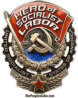
People's Cube gives itself Hero of Socialist Labor medal in recognition of continued expert advice provided to the Obama Administration helping to shape its foreign and domestic policies
Hamas: Israeli air defense unfair to 99% of our missiles, "only 1% allowed to reach Israel"
 Democrat strategist: without government supervision, women would have never evolved into humans
Voters Without Borders oppose Texas new voter ID law
Enraged by accusation that they are doing Obama's bidding, media leaders demand instructions from White House on how to respond
 Obama blames previous Olympics for failure to win at this Olympics
Official: China plans to land on Moon or at least on cheap knockoff thereof
Koran-Contra: Obama secretly arms Syrian rebels
Poll: Progressive slogan 'We should be more like Europe' most popular with members of American Nazi Party
 Obama to Evangelicals: Jesus saves, I just spend
May Day: Anarchists plan, schedule, synchronize, and execute a coordinated campaign against all of the above
Midwestern farmers hooked on new erotic novel "50 Shades of Hay"
Study: 99% of Liberals give the rest a bad name
Obama meets with Jewish leaders, proposes deeper circumcisions for the rich
 Historians: Before HOPE & CHANGE there was HEMP & CHOOM at ten bucks a bag
Cancer once again fails to cure Venezuela of its "President for Life"
Tragic spelling error causes Muslim protesters to burn local boob-tube factory
 Secretary of Energy Steven Chu: due to energy conservation, the light at the end of the tunnel will be switched off
 Obama Administration running food stamps across the border with Mexico in an operation code-named "Fat And Furious"

 Pakistan explodes in protest over new Adobe Acrobat update; 17 local acrobats killed
White House: "Let them eat statistics"
Special Ops: if Benedict Arnold had a son, he would look like Barack Obama

AD
GOES
HERE


 ©* 1917 – 2022
The People's Cube, Politburo and Central Committee of the Socialist
Shadow Party, Ministry of Truth, Comrades of Armed Organs, Young Pioneer
Organizations, Komsomol, Society for Sport and Technology, Society for
Advancement of Secondary Sexual Characteristics, and other groups and collectives
of our great Socialist American Motherland.
©* 1917 – 2022
The People's Cube, Politburo and Central Committee of the Socialist
Shadow Party, Ministry of Truth, Comrades of Armed Organs, Young Pioneer
Organizations, Komsomol, Society for Sport and Technology, Society for
Advancement of Secondary Sexual Characteristics, and other groups and collectives
of our great Socialist American Motherland.